Styling

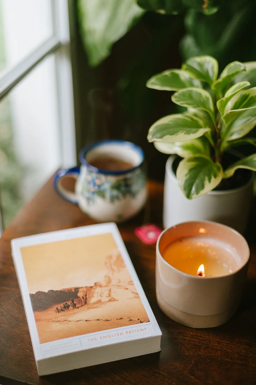

PHOTO CHALLENGE | Attempt to set up an intentional still life situation. Whether you’re stacking books to talk about or creating a moody scene, this can be very deliberate art, or product photography. The choice is up to you!
LOOK FOR THE DETAILS
Cohesion in color and textures
Background
Composition
This post is in collaboration with Michaela Devine of @mdevine.events
Michaela and I started The Ardent Biblio over three years ago, creating literary lifestyle content on our blog and Instagram, to share our reading life in an aesthetically pleasing way that brought community together. Over the years, we’ve founded the literary dinner party movement, elevated book clubs, and the concept of a literary lifestyle. These things have created a very strong partnership between photography, styling, and lifestyle images that we’ve nailed down. We’ve learned a lot from each other between photography & styling, and with each of our strengths woven together, we’ve shared the most important elements possible.
COHESION + COLOR are the biggest things. Things don’t have to be monochrome but they have to work together.
Layering and vignettes. Start with a place, decide what things to layer in. Example: a book on a table? Add a candle, a mug, a plant, check that your background doesn’t have any weird spots of a clashing color or a spot that needs tidying or rearranging.
Notice little scenes in your day to day life and figure out how to romance them a little. Like how your mug of tea and new plant look together on the coffee table? Light a candle, fluff the pillows and wait for good light to elevate the whole scene.
Aim for natural, not cluttered. Adding too many random things looks forced and busy. Elevate the scene in simple ways. What is your focal point and what things support that focal point without competing for attention? Sometimes what the camera sees is a little different than what your eye sees—you might have to take out or add in.
Bring in items that match the feel of what you’re going for. Sometimes looking around your house you’ll notice things you wouldn’t normally grab but fit the aesthetic you’re building.
Consider color/color palette when building a scene whether that’s a whole tablescape or just a little vignette with a prop. A pop of color isn’t always a bad thing when done strategically, but an out of place color can make the whole photo look off, and honestly, harder to edit. A good pop will play nicely with everything around it even while it calls attention to it self.
Pay attention to what the background will look like, a more cluttered background needs a simpler styling set up, and vise versa. This is a big one!
Don’t be afraid to move things around or add and subtract pieces until you get a balance you like.
Sometimes taking the time to set up a scene is really inspiring and gives you a lot of options. It feels inconvenient to move the table and pull things from their usual homes, and when you suddenly have this fresh scene in front of you that photographs well, it’s well worth the ten minutes of effort.
What setting up an intentional scene feels like to me:
I find a place in my house I want to use. I consider what’s in the background. A blank wall? My couch? My plants? The lines of my bar? I conjure visuals of things I think are pretty whether a scene from my own life or something I saw in a photo. I think about what items I have to pull that feeling or composition in. I muss with placement of said objects for a while, consider the colors I’m using and what kind of light I have. My style favors cozy home, plants, neutrals. Things that are cohesive and restful tend to do really well.
What setting up a bigger scene, like a tablescape feels like to me:
Before anything else, I decide what the color palette will be. I think about the space we are in and the light we have. All candlelight? Sunset? Gray afternoon? How do the colors I’m using interact with that? I then decide what items fit the aesthetic I’m aiming for. Sometimes I have to buy things, other times it all comes from my home. I figure out how to layer in the colors and things I want to use. Base color of the table, runner, candles, items, serve-ware. I decide which things will be the focus and which will be extras that make the space feel fuller without competing for attention. Style here can be all over the place, its just a matter of staying cohesive, whatever style you’re going for.